Media wall colour ideas
Date Published: September 26th, 2025
Some homeowners, once they’ve organised a TV and fireplace for their media wall, seem to think that’s the whole job finished. But if you leave things as they are (without giving any thought to colour), you may end up with a very lacklustre configuration.
The best media walls have a coordinated colour palette. After all, most setups start in an already finished living room. So, look around: what do you have to work with? Do you have your eye on a paint colour that would completely contrast with your current scheme?
If so, are there similar colours you can choose that won’t distract? What about the size and layout of your room: how do they come into play? Stay with Fires2U as we explore our top media wall colour ideas for 2025/26 and what you can do to find the best aesthetic.
Things to consider before choosing a colour
We recommend starting with the bones of your room.
By this, we mean the size of the space, ceiling height and the amount of natural light: all of these factors will steer your palette before anything else. Smaller rooms and lower ceilings usually benefit from lighter shades to keep things airy.
Generous, more well-lit rooms can carry deeper tones without feeling heavy. You should also pay attention to orientation.
North-facing rooms read cooler and can make greys and blues feel a touch icy, so lean into warmer undertones to balance the light. South-facing spaces are sun-drenched and can handle cooler hues that feel ‘freshening’.
Equally, anchor your choices in what already lives in the room. Flooring, sofas, timber finishes, metal trims and soft furnishings all influence how a paint colour looks.
So, you might want to pull accent shades from existing textiles and make sure your chosen wall colour flatters the fire’s frame.
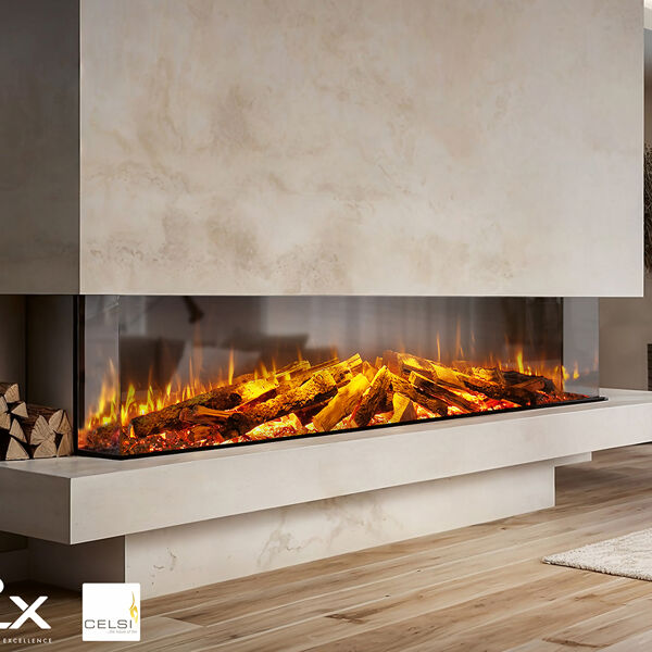
Warm neutrals and natural earth tones
Cocooning and calm, shades like creams, taupes, soft greys, clay and ochre create a warm backdrop that flatters both the TV and the fire without being too demanding. If you’re worried about keeping neutrals interesting, texture is the key.
Layer painted plaster with timber details, fluted or slatted panels, limewash, or microcement to add shadow. Even within one colour family, combining a matte wall with satin cabinetry, oak shelving, and a stone or plaster surround will make things feel less flat.
Also, be sure to tie the palette to what’s already in the room. Pick up tones from your flooring and soft furnishings (e.g., oatmeal sofas, wool rugs and natural wood), and add brushed brass to echo the firelight. It’s one of our subtlest media wall colour ideas.
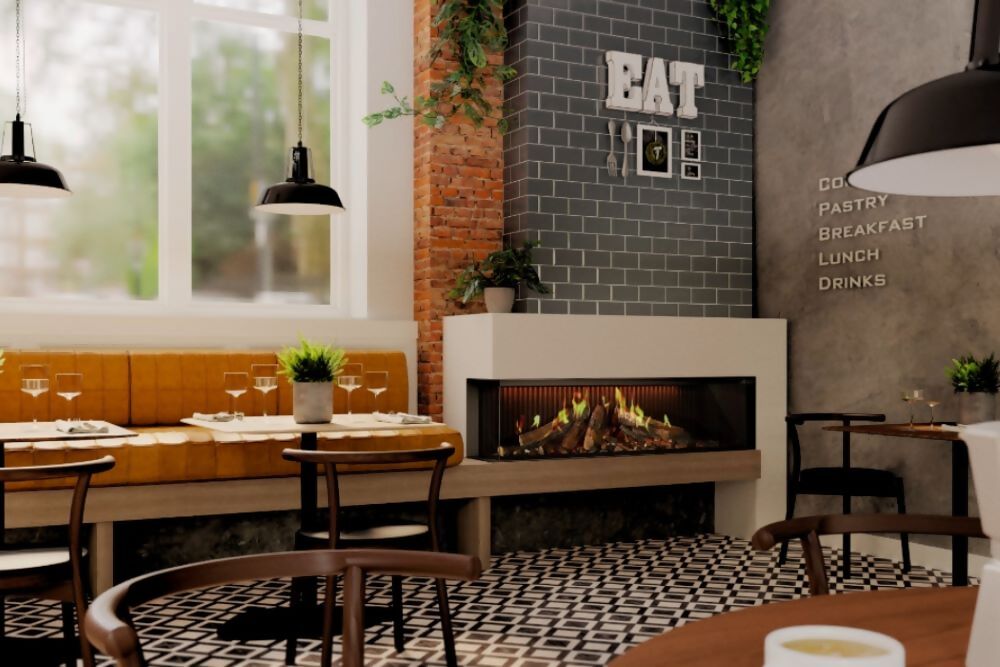
Bold contrast and statement colour
If you’re looking for a sculptural effect from our media wall colour ideas, a darker surround helps the screen visually recede into the media wall. Then, paired with a rich base with lighter cabinetry and pale shelving, delivers a clean, gallery-like contrast.
This approach is particularly effective when you have good natural light or ample artificial lighting. More space can stop these dark pigments from feeling oppressive, and the play between bright shadows becomes dramatic rather than heavy.
Keep sheens low around the screen to minimise reflections, then introduce subtle highlights through metal hardware, stone, or timber details.
Monochromatic layering
A single colour family might sound limiting, but monochromes lend themselves to layering.
Start with a mid-tone on the main wall so the TV and fire feel stabilised, then step darker in the recess or chimney breast. Balance that with lighter tones on adjacent returns, shelves or cabinetry to stop the composition from feeling heavy.
Here, texture does most of the hard work. Metal and stone are great for this palette: brushed nickel, pewter and pale concrete make great companions to grey, and
Subtle accents with neutral bases
Of our neutral media wall colour ideas, this one requires homeowners to start with a calm, neutral backdrop. Then introduce colour in measured doses: paint the back of a display recess or choose a contrasting tone for drawer fronts.
Here, accents are like punctuation: simple touches, like a single band of colour running up one side of the chimney breast, can make a world of difference without feeling garish.
The trick is to keep the colour palette disciplined. Pick one accent family and use it in two or three places rather than everywhere.
Dark and moody for a luxury look
Do you want your media wall to feel more like a home cinema? Tones like burgundy, forest green or inky blue will make your whole composition feel beautifully deep. Set against the glow of electric flame projection technology, movie night will look better than ever.
Pair these deeper tones with slim brass or bronze trims, smoked mirrors, reeded glass and patinated metals to introduce highlights that catch the light. Again, textural finishes, richly grained timber and limewash are great for preventing that flat, two-dimensional feeling.
Practical application: integrating Fires2U’s products
No media wall would be complete without the right fire! That’s why we’ve curated a collection of the best media wall fires from industry-leading brands. Here, you’ll find panoramic electric appliances from names like Solus, Onyx and Celsi.